08 — UI Design
The final screens
Every screen was designed around one principle: the fastest path from hungry to fed. Large tap targets, clear hierarchy, and a calm two-tone palette at every step.
Authentication
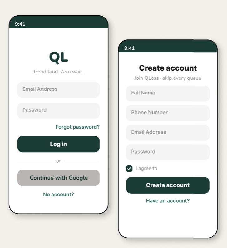
Onboarding that feels fast, not clinical
Login and signup screens are stripped to essentials. A toggle between Login and Sign Up eliminates navigation confusion. The deep forest green header creates instant brand recognition warm and trustworthy from the first tap.
Toggle tabs on a single screen no separate page navigation, reducing disorientation
Green brand header on all auth screens sets calm, trustworthy tone before any interaction
Amber CTA creates an unmissable primary action even against the neutral form background
Core Feature
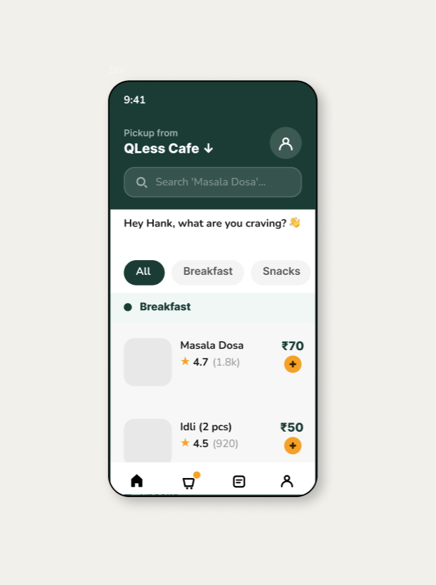
Dashboard — browse like Swiggy, order for your shop
The dashboard is the heart of QLess. A fixed header with location and search, horizontally scrolling category chips, and a vertically scrolling food list grouped by category familiar Swiggy-like patterns adapted for a single-shop context.
Horizontal category scroll keeps all categories reachable without leaving the screen
Category section headers with green dot anchors let users scan to their desired section instantly
Amber + button on each item keeps "add to cart" one tap away at all times
Core Feature
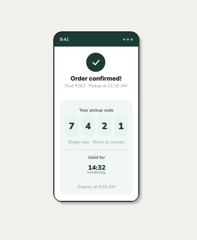
OTP pickup — confirmed in seconds
After payment, a unique 4-digit OTP is generated. The OTP screen shows the code in large, high-contrast digits with a countdown timer directly below no ambiguity about validity, no need to check email or SMS.
4-digit spoken OTP is faster than scanning a QR code works even if the screen is dimmed
Countdown timer below OTP removes anxiety user knows exactly how long the code is valid
Shop address shown below OTP one screen answers "what's the code" and "where do I go"