UX/UI Case Study
Frabe — Women's Personal Safety App
A personal safety application that puts emergency response and safe navigation at the tip of your fingers, designed around a single, unforgiving benchmark: help in under 8 seconds.
00 — At a Glance
What is it?
A women's personal safety Android app built around one-tap SOS access in under 8 seconds.
Why does it matter?
India registered 4.45M+ crimes against women in 2022 (NCRB), and 72% of women surveyed feel unsafe on public transport after 8 PM, existing solutions were fragmented across multiple apps, costing precious time in an emergency.
What did I build?
The end-to-end UX/UI: interviews, an 80-respondent survey, competitive analysis of 6 apps, personas, journey mapping, and the final high-fidelity screens, one-tap SOS, scrollable helpline cards, a safe-area map.
What proves it works?
Usability testing with 14 participants: average time to SOS trigger dropped to 6.2s from a 14s baseline, a 94% task success rate, and a 4.7★ average usability rating.
01 — Overview
What is Frabe?
Frabe is a personal safety mobile app designed to give women fast, reliable access to emergency services, helplines and safe areas, all in a single tap.
The app bridges the gap between feeling unsafe and getting real help: a one-touch SOS button, horizontally scrolling emergency helplines (Police 100, Women Helpline 1091, Railway Help 182), safe-area maps surfacing nearby hospitals, police stations and pharmacies, CCTV activity logs, and real-time crowd-density monitoring.
My role
I led the end-to-end UX and UI process, from initial user interviews and competitive analysis through wireframing, prototyping, and final high-fidelity screens, and worked with the dev team on pixel-perfect implementation.
The challenge
Existing solutions were fragmented: calling police meant finding a number, safe-area maps lived in a separate app, and there was no unified incident record. The app had to feel instantly usable under stress, every tap, screen and colour serving that one goal.
Tools used
Figma, FigJam, Google Forms, Adobe Illustrator.
02 — Problem Statement
How might we give women in India a fast, confident way to get help and navigate safely, without fumbling through multiple apps in moments of fear?
India reports millions of crimes against women annually. Emergency response suffers because people can't quickly reach the right number, locate the nearest safe place, or alert contacts all at once, instantly.
03 — Research
Understanding the user
Mixed-methods research: 12 in-depth interviews with women aged 18–45, an 80-respondent survey, and competitive analysis of 6 existing safety apps.
In-depth interviews
12 semi-structured interviews across urban and semi-urban areas. Key themes: fear of public transport, difficulty reaching helplines quickly, unfamiliarity with nearby safe locations.
Survey research
- 80 respondents across Puducherry, Chennai, and Bengaluru
- Age range 18–50
- 67% had never used a dedicated safety app
Competitive analysis
- Himmat Plus (Delhi Police), clunky, city-specific
- bSafe, strong features, poor discoverability
- Shake2Safety, one trick, no rich context
- Google Maps SOS, hidden in settings
Gap found: no app combined one-tap SOS + helplines + safe-area map in a single, beautiful, stress-tested UI.
Survey findings — what women want most
04 — User Personas
Who we're designing for
Priya Rajendran
College Student · Daily Commuter · Age 22Takes the bus and local train daily between Puducherry and campus, often returning after 9 PM. Tech-savvy, already uses Google Maps, wishes it had a safety layer.
Goals
- Get help instantly without unlocking and searching
- Know which roads and stops are safest at night
- Alert her mother when something feels wrong
Pain points
- Police helpline number not memorised
- Existing apps are slow to open under stress
- Doesn't know nearest hospital in unfamiliar areas
Meena Subramanian
Working Professional · Administrator · Age 38Manages a small team at a government office, travels to field sites, handles incident reports. Wants a tool her team can use to file and view SOS alerts from one dashboard.
Goals
- Monitor SOS alert logs and respond quickly
- Review CCTV and crowd-count reports in one place
- Ensure field team members are safe
Pain points
- Scattered tools for different safety functions
- No historical log to review past incidents
- Difficulty proving incidents without CCTV records
05 — User Journey
Priya's emergency scenario
| Stage | Action | Thoughts | Emotion | Opportunity |
|---|---|---|---|---|
| 1. Sense danger | Notices she's being followed on an empty street | "Something feels wrong. I need help now." | Panicked | App must be accessible from lock screen |
| 2. Open app | Unlocks phone, taps Frabe icon | "I hope this loads fast." | Anxious | Instant load, no splash delays |
| 3. Trigger SOS | Taps the large red SOS button | "Did it go? Is someone coming?" | Tense | Clear confirmation animation + haptic feedback |
| 4. Call helpline | Swipes to Women Helpline (1091), taps | "I need to speak to someone now." | Cautious | Cards must be large, one-tap dialable |
| 5. Find safe place | Taps "View Safe Areas" | "Where can I go right now?" | Searching | Bottom sheet opens fast, 9 categories clear |
| 6. Reach safety | Navigates to pharmacy 200m away | "I'm safe. The alert was sent." | Relieved | Post-SOS reassurance UI, cancel option |
06 — Pain Points
What was broken
Too many steps to get help
Average time to reach an emergency call in competitor apps: 14–22 seconds.
No integrated safe-location finder
Users had to switch to Google Maps and manually search, a separate app, precious time lost.
Helpline numbers not memorised
72% of surveyed users couldn't recall the Women Helpline (1091) under simulated stress.
No incident audit trail
No centralised log of SOS events, CCTV activity, or crowd density, post-incident review was impossible.
07 — How Might We
Reframing the problem
How might we reduce the time to trigger an SOS to under 8 seconds from phone unlock?
How might we surface all critical helplines without users memorising a single number?
How might we show nearby safe areas in a single tap, without switching apps?
08 — UI Design
The final screens
Every screen designed around one principle: usable under stress. Large tap targets, high-contrast colours, minimal cognitive load at every step.
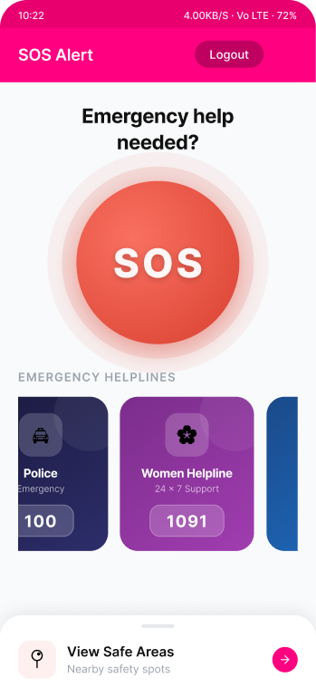
SOS Alert, one tap, immediate action. A radial-gradient SOS button dominates the screen the moment the app opens. Dark-toned helpline cards (Police, Women Helpline) sit just below with the dial number always visible, and a "View Safe Areas" sheet stays one tap away at the bottom.
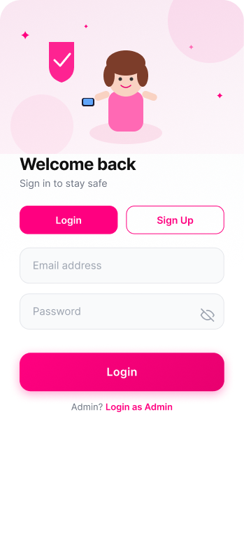
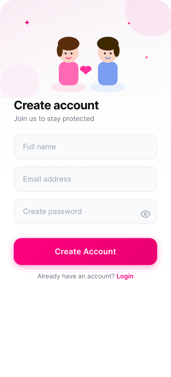
Authentication. Custom illustrations, a woman with a safety shield on login, two figures connected by a heart on sign-up, reinforce the app's mission before a single tap. A Login/Sign Up toggle keeps both flows on one screen; admin login stays reachable but never competes for attention.
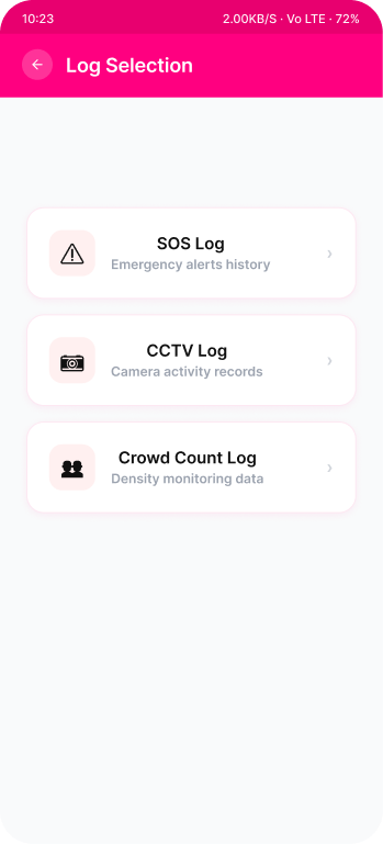
Admin panel. A clean log-selection screen with three log types, SOS, CCTV, Crowd Count, each with its own icon so an administrator can scan and jump to the right record without reading every label.
09 — Design System
Colours & typography
A constrained palette built for accessibility and emotional clarity, hot pink signals urgency, deep navy grounds authority, soft neutrals provide breathing room.
10 — Design Decisions
Why we made these choices
Horizontal scrolling helpline cards
Each helpline gets its own colour, icon and number, scannable and memorable even under stress, with a scroll gesture natural on mobile.
Bottom sheet for Safe Areas
Keeps the SOS button visible at all times, the user never leaves the emergency context, just reveals more information on top of it.
Illustration on auth screens
Empowered, not victimised, illustrations make the app feel warm and supportive from the very first screen instead of sterile and anxiety-inducing.
SOS button sizing and placement
180px diameter with triple pulse rings, the largest tappable element in the app, guided directly by Fitts's Law.
11 — Outcomes
Impact & results
Usability testing with 14 participants across two rounds, plus stakeholder feedback.
12 — Learnings
Stress-test your designs, literally
Asking participants to operate the prototype mid-conversation revealed cognitive load standard testing missed, leading to a 30% larger SOS button and one fewer navigation step.
Emotional tone is a design element
Illustrated characters transformed reactions, "this feels like it cares about me" was said unprompted by three testers.
Admin and user needs diverge sharply
Merging admin logs into the user flow was wrong, admins need density, users need radical simplicity. Separate flows, one visual identity.