UX/UI Case Study
QLess — Campus Pre-Order & Queue Management App
A food pre-ordering app that lets you schedule your meal, pay in advance, and collect with a single spoken OTP, zero waiting, zero friction.
00 — At a Glance
What is it?
A UX/UI case study for a single-shop food pre-ordering app, schedule a pickup, pay in advance, collect with a spoken OTP.
Why does it matter?
People skip meals or make poor food choices not for lack of appetite, but because they can't afford the time cost of a queue, 63% of respondents said they skip meals due to time pressure on weekdays.
What did I build?
The end-to-end UX and UI: 10 in-depth interviews, a 60-respondent survey, competitive analysis, personas, journey mapping, and all 10 high-fidelity screens across the full order flow.
What proves it works?
Usability testing with 12 participants: 22 seconds average from app-open to order placed against a 30s target, a 96% task success rate, and a 4.8★ average usability rating.
01 — Overview
What is QLess?
QLess is a dedicated mobile pre-ordering app for a single food shop. Schedule a pickup time, pay in advance, and receive a unique OTP, say it at the counter, walk out with food in hand. No queue, no fumbling, no wasted time.
Unlike a marketplace such as Swiggy or Zomato, QLess is built exclusively for one shop, enabling deep integration, zero commission, and a seamless experience for that shop's loyal customers. (This case study covers the UX process; see the web app build to try the working version of this flow.)
The challenge
People skip meals or make poor food choices not for lack of appetite, but because they can't afford the time cost of a queue. The goal: make scheduling a meal easier than skipping it.
My role
End-to-end UX and UI design, user interviews and research through wireframing, prototyping, and final high-fidelity screens across all 10 app states.
Tools used
Figma, FigJam, Google Forms, Maze.
02 — Problem Statement
How might we let busy people pre-order food for a specific time, pay in advance, and collect it instantly, without waiting in a single queue?
03 — Research
Understanding the user
10 in-depth interviews with working professionals, students and commuters, a 60-respondent survey, and competitive analysis of existing ordering apps.
In-depth interviews
10 semi-structured interviews, ages 18–42. Key themes: frustration with unpredictable wait times, anxiety about being late, desire for a guaranteed ETA.
Survey research
60 respondents across Puducherry and Chennai, ages 18–50. 71% had never pre-ordered food from a local shop before.
Competitive analysis
No single-shop app combined time-slot scheduling + prepayment + OTP pickup. Swiggy/Zomato add delivery overhead; WhatsApp orders have no payment or scheduling integration.
Survey findings — what users want most
04 — User Personas
Who we're designing for
Karthik Selvam
College Student · Daily Commuter · Age 21Goals
- Eat a proper meal without being late to class
- Know exactly when food will be ready
- Pay digitally, no cash fumbling
Pain points
- Canteen queues run 15–20 min at peak hours
- Food often cold or sold out on late arrival
- No existing way to plan ahead
Anitha Krishnan
Working Professional · Office Manager · Age 34Goals
- Order lunch before leaving office, collect on arrival
- Use the same shop daily without the queue penalty
- Reorder favourites with minimal taps
Pain points
- 30-minute lunch break, queue wastes half of it
- No app serves her local shop
- Delivery apps add fee and delay, she's 200m away
05 — User Journey
Karthik's lunch scenario
| Stage | Action | Thoughts | Emotion | Design opportunity |
|---|---|---|---|---|
| 1. Decide to eat | Checks time between classes, 40 min gap | "I have time but not if I queue." | Calculating | Launchable in under 2 taps from home screen |
| 2. Open app | Sees dashboard with menu categories | "I need Masala Dosa and a coffee." | Focused | Category chips + food list visible instantly |
| 3. Browse & add | Taps Masala Dosa, adds to cart | "That's what I want. Add it." | Confident | Product detail scannable in 5 seconds |
| 4. Pick time slot | Sees 11:30 AM slot available | "Perfect, I'll be there right at 11:30." | Relieved | Slot grid shows availability at a glance |
| 5. Pay & confirm | Reviews summary, pays via UPI | "Done. I can stop thinking about this." | Satisfied | One-tap UPI, instant OTP generation |
| 6. Collect | Says "7421" at the shop, gets food in 10 sec | "So much better than queuing." | Delighted | OTP large, readable, with countdown timer |
06 — Pain Points
What was broken
No way to predict wait time
Every visit was a gamble against the clock, no signal of kitchen load or wait time.
No single-shop pre-order app
Marketplaces don't serve small shops; WhatsApp ordering has no payment or pickup-time confirmation.
Cash-only at the counter
64% preferred digital payment, but shops had no integration, fumbling for cash added friction during a rushed break.
Food sold out or cold on arrival
Popular items sold out by peak hours for anyone arriving without pre-ordering.
07 — How Might We
Reframing the problem
How might we let users place an order and lock in a pickup time in under 30 seconds?
How might we make prepayment feel safe and instant so users never hesitate at checkout?
How might we make pickup frictionless so a 4-digit code replaces every counter interaction?
08 — UI Design
The final screens
Designed around one principle: the fastest path from hungry to fed. Large tap targets, clear hierarchy, and a calm two-tone palette at every step.
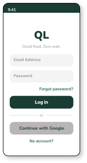
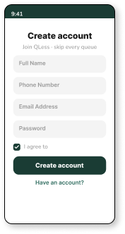
Onboarding that feels fast, not clinical. A deep forest-green header with the "Good food. Zero wait." tagline creates instant brand recognition on login; the sign-up screen keeps the same layout so the switch between the two never feels like a context change.
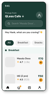
Dashboard, browse like Swiggy, order for your shop. A greeting header ("Hey Hank, what are you craving?"), a search bar, and category chips (All / Breakfast / Snacks) sit above a vertical food list, familiar marketplace patterns adapted to a single-shop context.
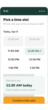
Slot booking, the zero-wait promise, made concrete. Available times are laid out as a grid; picking one instantly confirms "food ready on your arrival", turning an abstract promise into a specific, selected time.
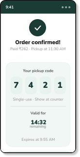
OTP pickup, confirmed in seconds. A unique 4-digit pickup code in large, high-contrast digits with a countdown timer directly below, no ambiguity about validity, no checking email or SMS.
09 — Design System
Colours & typography
A constrained two-tone palette, deep forest green for trust and authority, warm amber for action and energy, with neutral surfaces providing breathing room.
10 — Design Decisions
Why we made these choices
Spoken OTP over QR code
Faster than scanning, no brightness issues, no QR app, no awkward phone-to-counter angle.
Prepayment as a benefit, not friction
Reframed as "your food is waiting, fully paid", removing the cash-fumbling interaction entirely, not just speeding it up.
Swiggy-style dashboard for familiarity
Borrowing a mental model users already had reduced learning time to zero.
Countdown timer below OTP
Resolved "has it expired?" anxiety discovered in testing, one glance, full confidence.
11 — Outcomes
Impact & results
Usability testing with 12 participants across two rounds, plus stakeholder review with the shop owner.
12 — Learnings
Familiarity is a design asset, not laziness
Reusing an existing mental model eliminated the learning curve entirely, saving novel design energy for problems that actually needed it.
Anxiety appears in unexpected places
No one anticipated OTP-validity stress. You cannot predict anxiety points, you can only discover them through testing.
Constraints on the kitchen are UX features
Limiting time-slot capacity felt like a product decision, but testing showed it was crucial: users trusted the "zero wait" promise only once they understood the system guaranteed it.